 |
|
Set the Wayback Machine: “Viva” Astrology
January 5, 2009 on 12:57 am | By Michael | In Gigs, Notes | 4 CommentsI thought it would apropos and an interesting idea to start the New Year off by initiating a series of posts that looks back at some of my work from times gone by. Much of this work will be pre-digital—done the old fashioned “analog” way, with pen and ink. Most was done as pre-separated art: I inked my art on multiple cells of frosted mylar using a Rapid-O-Graph technical pen. Basically the areas of black ink on each cell could be designated to print either with CMYK callouts or with Pantone numbers. It was a very laborious process that was easily duplicated after the first few versions of Adobe Illustrator had come out.
 |
 |
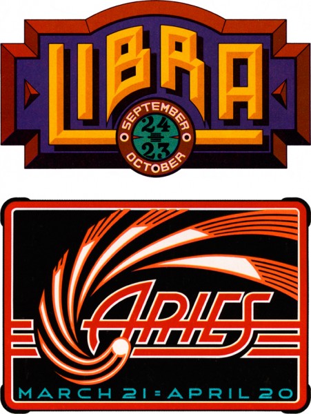
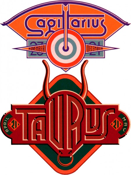
Four Astrology Sign “Logos” for VIVA Magazine
So right now let’s set the Wayback Machine for the mid ’70s and VIVA magazine published by Penthouse (a kind of Playboy for women). The Art Director—the late Rowan Johnson—asked me to design logos for their monthly astrology column which would change with each issue. Even though at the time I was paid quite a paltry sum for my efforts, this was a great ongoing project for me. Much like my recent “Jewish Zodiac” project, I saw this assignment as an opportunity to create a portfolio of distinct yet related logos. I think they really highlight the possibilities of using letterform design not as an end in itself, but as part of a total design concept where letters are treated as one of several related illustrative elements, and integrated into an expressive whole.
4 Comments
RSS feed for comments on this post. TrackBack URI
Leave a comment
Powered by WordPress and Nifty Cube with Recetas theme design by Pablo Carnaghi.
Entries and comments feeds.
Valid XHTML and CSS.
Thanks Andy. Just wondering if you ever worked with a Rapidograph. If you did you’d know what a timesaver working on a Mac has become. When I think back I wonder how I ever was able to get this work done on time. By the way, I’ve just added your blog to my links list. I really like what you’ve been finding.
Comment by MD — January 7, 2009 #
Wow, these are all great. What first grabbed my attention is how you handled the lighting on the inner bevels of the Taurus logo–where natural lighting would likely create a gradient–this gives a similar effect and works so well with the rest of the imagery.
The arrow forming the two T’s in Sagittarius is awesome. I saw the two T’s first–when I saw the arrow I suddenly felt very clever like it was I who had come up with it. Ha!
I think Libra is my favorite because it reminds me of what you’d see on a movie marquee + I really dig the color scheme.
Wow. And all done with a Rapidograph pen.
Comment by Heckadude — January 5, 2009 #
The exploded Cootie! Done for “Heaven”. Unfortunately I have nothing on that (I wish I did). It was done for Brad Benedict, and that’s tantamount to saying that the art was sucked into a large black hole.
Comment by MD — January 5, 2009 #
As good back then as it is now, your designs are something to marvel at. You were and will always be a meticulous artist of magnum caliber!
Where’s that “Cootie” T-Shirt design you did way back?
Comment by José Cruz — January 5, 2009 #