 |
|
Kiss Kulture Klash
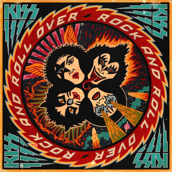
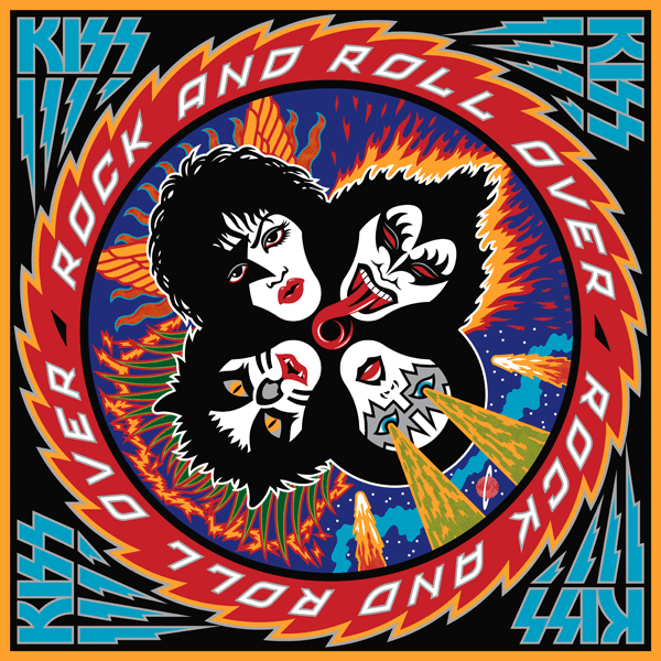
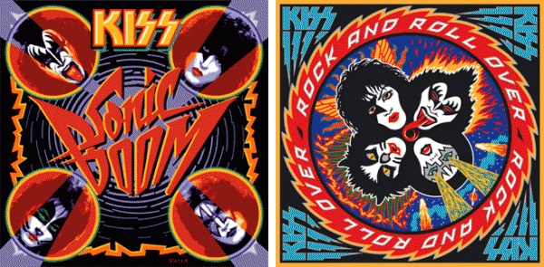
April 17, 2013 on 5:19 pm | By Michael | In Gigs, Notes, Wayback Machine | 1 CommentWhen I was asked to design and do the art for KISS’ 4th studio album Rock and Roll Over, I was fairly ignorant of the culture that was forming around the group. I was unencumbered by any preconceived ideas as to what the group and their music was about. Many are surprised to hear that Gene, Paul, Ace and Peter had to explain their different personas to me before I started working on the design.
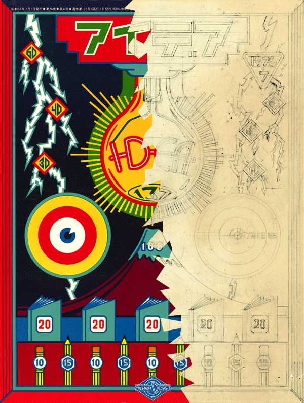
I’d love to be able to show my working pencil sketches, but over the years they’d gotten lost or destroyed, and the only record left was the original colored pencil comp that I used to explain my concept to the group. A few months earlier I had done a cover for IDEA, a Japanese art magazine that had done an article about my work, and for whom I had created a cover. I really loved how that cover had turned out, so my thought was to try to emulate the look I had come up with on this new cover for KISS. My cover for IDEA had certain gamelike, and very graphic elements that I thought would work well telling the story of what KISS were about.
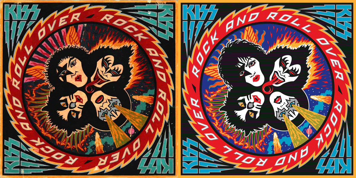
Since their makeup reminded me of classic Japanese Kabuki players, I thought the look would be appropriate. So I created a little story around each character and put them all together in a sort of “mandala” motif surrounded by a sawtooth blade with lettering. I kept the colors simple and bold as I had done with my IDEA cover. Here (yellowed and a bit worn with age) is the original colored pencil sketch I created for the group’s approval:
The meeting went particularly well, since I was expecting outright rejection of my idea—which at the time was pretty unorthodox for an LP cover. The changes gthey asked for, I felt, were fairly minor—adjustments to the faces (with the exception of Peter Criss), and rotating the lettering 90°.
The KISS logo already existed, but I felt it needed some help to work better with my design (Paul told me he had drawn it on his dining room table). So I redrew it, making the design more consistent, and adding the lightning strokes to help give movement to the sawtooth blade.
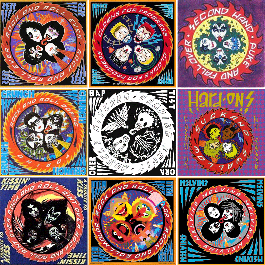
After the cover was done, I didn’t think about it very much. It was only years later that I came to understand that this cover had taken on a life of its own and become sort of a cultural icon. I started to realize that when I discoved all the incredibly blatant and poorly done rip-offs of my design. Rather than upsetting me, seeing all that was quite amusing . . . after all, isn’t imitation “the sincerest form of flattery”?
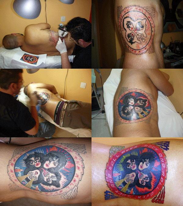
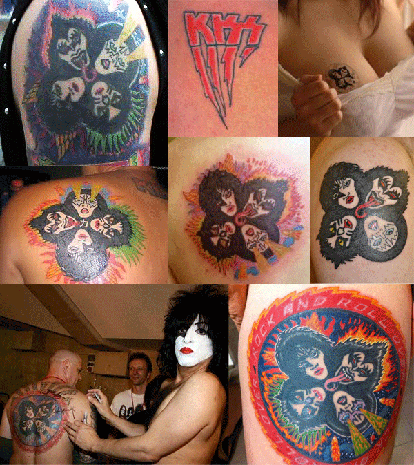
Another indicator to me of how pervasive this design had become in the culture was that people were having it permanently etched onto their bodies. This both horrified, and delighted me at the same time! Personally I would never have anything tattooed on my body—especially one of my own graphics: I’d get bored with the design way too quickly, and then it would be too late to do anything about it. Here are some shots of the process of one lucky soul having the complete Rock and Roll Over art permanently engraved on his right flank. The tattoo artist did a pretty good job, if you ask me!
And below, for your viewing pleasure, a few more of my favorite RaRO tattoo shots. I especially like the one of the guy getting his back autographed by Paul Stanley. Now that’s what I call Kiss Kommitment!
Speaking of Paul, he contacted me again recently. It seems that KISS were about to record their 19th studio album. They hadn’t done one of those for eleven years, and he told me they wanted to recapture some of the magic that the Rock and Roll Over design had provided for them when they were starting out. So, in a way they kind of wanted Rock and Roll Over All Over Again—the same . . . but different.
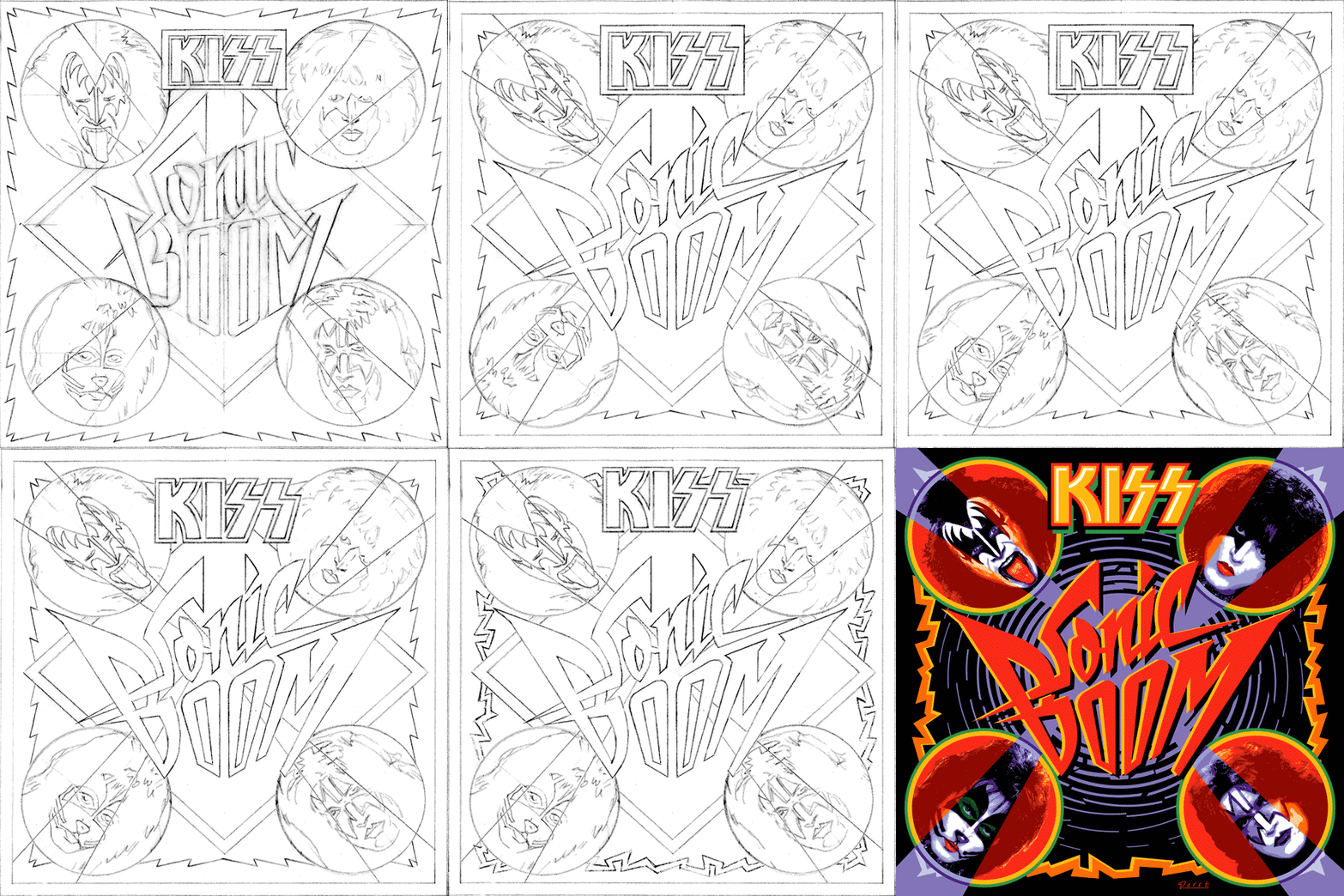
Attempting to recreate the success of an iconic image is a thankless task. You can’t realistically have that as a goal. The most you can do is to give it your all and try to do the best piece of art you’re capable of doing. Here are a series of rough sketches that led up to the finished design
The hardest part of this process was figuring out what to do with the four faces. This time Paul wanted them to be photographic instead of just plain old graphic—as they were the first time around. And I couldn’t get new photography—it had to be taken from existing files. The approach I decided on was to take the best photos I could find with the most contrast and shadows, and translate them into flat graphics that I could make work with the rest of the art. I’ve simplified the steps a bit, but here’s an example of what I did with the faces, using a photo I found of Gene’s face:
Everybody’s got an opinion as to whether the art for Sonic Boom is better or worse than that for Rock and Roll Over. Being so close to both designs it’s difficult for me to say. As far as Sonic Boom is concerned, I did the best I could within strict limitations provided by Paul. I think it solved the problem, and I’m quite happy with the results.
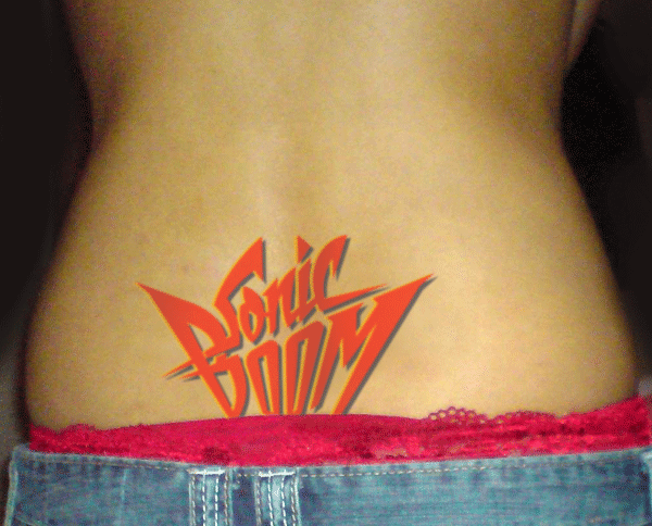
I’ll leave it to time, to posterity, and to others to decide if Sonic Boom becomes as much a cultural touchstone as Rock and Roll Over did. If it does, we may soon start seeing . . .
Purchase an original “Rock and Roll Over” press proof HERE
Podcast Interview on PodKISSt
October 30, 2009 on 5:54 pm | By Michael | In Gigs, News, Wayback Machine | 2 CommentsAfter doing my first live radio interview for WXRX I did another, slightly longer interview for the KISS fansite “PodKISSt“. In this interview I discuss influences on my work, how the two covers for KISS came to be, the limited edition prints of those covers, international problems with the KISS logo, crazy fans, and some advice for budding young artists out there.
The Return of . . . KISS (#3)
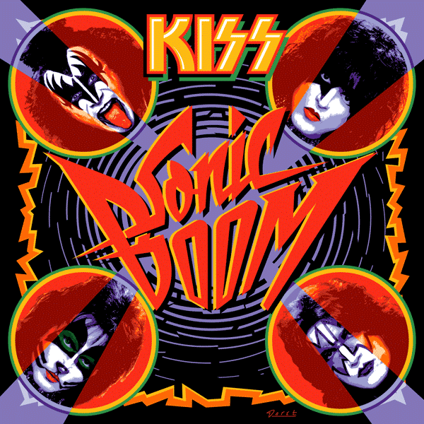
August 18, 2009 on 2:52 am | By Michael | In Gigs, News | 40 CommentsIn developing and refining my pencil sketch for Sonic Boom I wasn’t completely happy with how the background was working with the diamond shape and the positioning and scale of the lightning border (a small nod to RaRO). I also wanted to play up the idea of something shattering (i.e. from a sonic boom). So I came up with the semi-abstract idea of concentric circles rippling outward like water, only breaking up incrementally into smaller and smaller segments as they expanded, changing the background color from violet to black. It seemed like a fairly simplistic idea, so I tried it and it worked. It also seemed to serve well to both ground and amplify the light beams emanating from the center, which break through the faces. I went through several color iterations, ending with one that had a dark red bleed border. I showed that version to Paul. He looked at it for a minute and then suggested we just change the border to black. We both agreed that this worked better, finishing the design process on this piece.
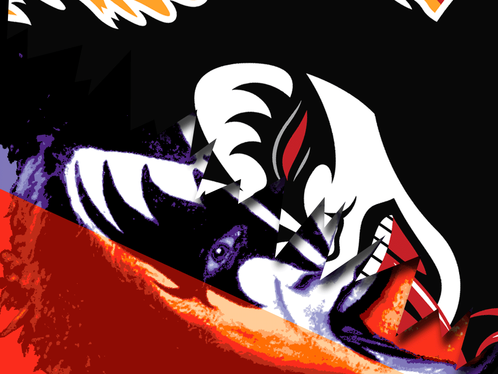
I did have to redo all the art for the CD/DVD package, which has a slightly more horizontal proportion. That meant shifting and manipulating the proportions of many of the elements. Because the angle of the beams had changed in the new configuration, the most complicated part of this was redoing all the faces. It’s a little difficult to tell what went into the face art, transforming them from normal color photographs, so here’s an enlarged detail:
At first glance, it might look as though I accomplished this using some version of Photoshop’s posterize filter—but I didn’t. The photos needed to be manipulated quite extensively to gain the look I was trying to achieve. I used a similar process when I did the graphics for the Jewish Zodiac pieces.
I’m hoping this art will elicit strong reactions from KISS fans and art enthusiasts alike. My intention was to stir nostalgia for the era of Rock and Roll Over, while inviting the same enthusiasm for new adventure that the Sonic Boom albums and DVD intend to do.
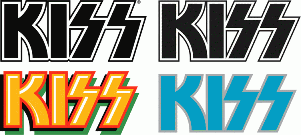
The avid KISS fan will note that the KISS logo on Sonic Boom is not the “official” logo. As I did with RaRO, I redrew the KISS logo after discussing the idea with Paul Stanley. He knew that I had redrawn it for RaRO, and liked the result. In fact, he told me that I’m the only designer who he would ever allow to do that! Below I’ve posted an image with the official KISS logo (at upper left) and just to it’s right, my redrawn version. Below that are (on the left) the logo from Sonic Boom, and the one from RaRO.
Tinkering with the KISS logo, ever so slightly, was an important step towards seamlessly blending the iconic logo with the (hopefully) iconic cover design. I’m very happy with end result, which you see on the cover of Sonic Boom. It truly has been a pleasure to return to my roots, in essence, by rejoining the creative process with KISS. As it was the first time, this experience was one to remember! I can’t wait for the next adventure…
Powered by WordPress and Nifty Cube with Recetas theme design by Pablo Carnaghi.
Entries and comments feeds.
Valid XHTML and CSS.



![SonicBoom_Square[trim]](http://alphabetsoupblog.com/wp-content/uploads/2009/08/SonicBoom_Squaretrim-600x600.gif)
![SonicBoom_Square[detail]](http://alphabetsoupblog.com/wp-content/uploads/2009/08/SonicBoom_Squaredetail-600x600.gif)
